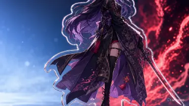
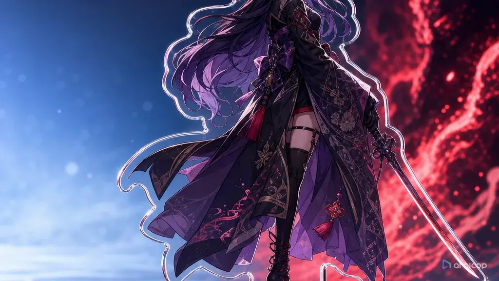
Introduction to Character Standing Art
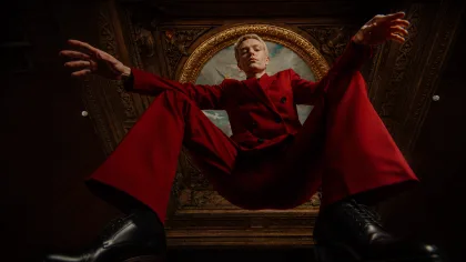
The usual standing art failure is painful because it looks almost right. You get a polished character, then notice the boots are cropped, the sleeve hides one hand, the back accessory cannot be read, and the pose is too angled to reuse as a reference. It may be attractive as a social post, but it is weak as a production asset.
Character standing art has a different job from a poster. It needs to make the full design inspectable: face, hair shape, outfit layers, hands, shoes, props, and silhouette. A later storyboard, voice line, or action shot will borrow from this image. If the standee is vague, every later prompt has to guess.
This guide shows how to prompt character standing art that survives a real ArcLoop workflow. Start from the character asset field breakdown to lock identity first. Then build or reuse a world in ArcLoop Worlds, and keep the standing art tied to the shot plan instead of treating it as a decorative one-off.
Core Principles for Character Standing Art
Make the body readable before you make the rendering fancy. A standee should show head-to-toe proportions, shoe shape, hand pose, clothing layers, and the character's normal posture. Dramatic lighting and effects can wait.
Give the character a design anchor that is easy to verify. One unusual accessory, a clear color break, or a prop held in a predictable place is more useful than ten tiny ornaments. The anchor lets you compare future shots against the same identity.
Separate neutral standing art from action illustration. Standing art can have personality, but it should not be mid-jump, half turned away, hidden behind foreground objects, or buried in motion blur. The best pose is usually calm enough to read and specific enough to feel owned by the character.
Control the silhouette. If a cape, skirt, tool bag, or long hair changes the outline, describe how it rests around the body. A clear outer shape is what makes the character recognizable at thumbnail size.
Use plain constraints at the end. "Visible shoes, clean hands, no cropped feet, no hidden prop, no extra cast members" sounds basic, but those lines prevent the most common failures. Short constraints beat a crowded paragraph.
Review the standee as a source asset. Ask whether another person could write a shot prompt from it without asking what the boots look like, which hand holds the tool, or where the accent color belongs.
Step-by-Step Character Standee Prompt Method
Start with the character's production role. Write one sentence that says what kind of scenes this person will appear in. A cooking-show host, tower guard, school racer, and museum thief need different stance, props, and clothing logic.
Add stable identity details. Include hair shape, face cue, outfit silhouette, shoe type, and one prop. Do not list every seam. The prompt should make the design memorable, not microscopic.
Define the standee pose. Use "front-facing relaxed stance," "slight three-quarter front pose," or "neutral pose with weight on the back foot." If you need turnaround later, keep the camera honest and avoid extreme perspective.
Set the asset boundary. Say whether you want a clean background, simple floor shadow, transparent-feeling cutout layout, or a small environment strip behind the character. Standing art should not disappear into a busy set.
Name the review checks. For example: face stable, both hands visible, shoes visible, prop readable, outfit layers clear, silhouette clean. These checks are more useful than vague requests for "high quality."
Create a draft before final polish. Keep the character asset's reference images visible beside the canvas as you work, then generate a low-cost pass. If the pose is wrong, fix the pose. If the palette is wrong, fix the palette. Do not rewrite the whole character after one miss.
When you need a template start, use OC Character Sheet Front Turnaround. If the standee will become an animated introduction, pair it with the scene advice in How to Write 2D Anime Animation Prompts.
Build Character Standing Art Inside ArcLoop
The standing art does not have to live alone in ArcLoop. Keep the character asset, its reference images, and the shots that use it in the same project, so a design stays consistent across a trailer, a short-drama beat, and a thumbnail.
Before you generate, decide what this standee is for: a reusable character asset, an outfit approval pass, a prop check, a lineup comparison, or a pre-animation reference. That purpose tells you, on the canvas, what kind of draft you are judging.
For continuity, keep approved anchors unchanged between passes. If the first draft nails the crescent hair clip and boot shape, carry those forward. If only the hand pose fails, regenerate for hand readability and leave the rest of the design stable.
Standing art becomes stronger when it feeds the next production step. Once the asset reads cleanly, use it to build a storyboard card, pose test, or opening shot in 2D Animation AI Templates. The standee should reduce future prompt work, not create another isolated image.
Example Prompt 1: Rooftop Greenhouse Standee
Create full-body character standing art for Elian Voss, an original rooftop greenhouse caretaker in a quiet solar-city anime setting. Show him in a slight three-quarter front pose, standing on a simple pale floor with a soft contact shadow. Identity anchors: copper-brown short curls, oval green glasses, cream utility vest over a dark teal shirt, rolled work pants, clay-colored ankle boots, and a brass watering wand clipped to his belt. His posture is careful and observant, with one gloved hand resting near the wand and the other hand visible at his side.

Asset goal: a reusable reference image for this character's later shots. Make the silhouette clean from head to toe, show both shoes, keep both hands readable, and make the belt tool easy to identify. Use clean 2D anime line art, soft greenhouse daylight, and restrained color. No text, no logo, no cropped feet, no hidden hands, no extra character, no photorealism, no heavy background plants covering the outfit.
This prompt treats the standee as an asset. The greenhouse setting informs the design without burying the full body in scenery.
Example Prompt 2: Polar Market Outfit Check
Create a front-facing character standee for Nera Quilt, an original polar night market courier who delivers warm food between ice canals. Full body visible, feet flat, camera at chest height, clean cutout-style background with a faint blue floor reflection. Character anchors: straight black bob with one white streak, round amber eyes, quilted cranberry parka, charcoal snow skirt over leggings, square insulated lunch case in her left hand, and chunky cream snow boots. Her right hand is open and visible, as if waiting for the next order.

Use this as an outfit approval reference for the character asset. The parka shape, lunch case, boot soles, hair streak, and glove color must remain clear enough for later animation prompts. Keep the pose calm, practical, and balanced. Clean cel-shaded anime style, cool blue ambient light with warm food-case glow. No busy market crowd, no cropped boots, no mitten blobs, no text signs, no random brand marks, no style imitation.
The camera and asset boundary are specific. That keeps the market idea from turning into a crowded illustration.
Example Prompt 3: Stage Mascot Lineup Asset
Create standing art for Brio Vale, an original stage mascot designer preparing for a small festival performance. Show a full-body neutral pose with a slight confident lean, white background, thin ground shadow, and enough margin around the character for lineup comparison. Identity anchors: lilac undercut hair, small triangle earrings, lemon-yellow chore jacket, black shorts over striped tights, red lace-up boots, and a folded paper mascot head tucked under his right arm. His left hand is visible and relaxed, not hidden in a pocket.

Purpose: a character lineup reference asset, made before storyboard planning. Make the outfit layers readable, keep the paper mascot head simple, show the boot laces without over-detailing, and preserve a crisp silhouette. Style: bright 2D anime production art, clean outlines, flat colors with gentle shadows. Avoid dramatic pose, cropped legs, extra fingers, extra props, background audience, text, watermark, and photorealistic costume texture.
This version is built for comparison with other characters. It avoids performance staging until the lineup is approved.
Common Mistakes in Character Standing Art
The first mistake is asking for a poster when you need a standee. Posters can hide shoes in fog and cover hands with props. Standing art needs inspection, so the whole body must stay visible.
The second mistake is overloading the outfit. If every strap, charm, badge, and embroidery must stay exact, the model may lose the big design. Pick the details that future shots must reuse.
Another mistake is letting the background compete with the character. A cafe, greenhouse, market, or stage can guide the outfit, but the standee should still read on its own.
Creators also forget the feet. Shoes define stance, scale, and genre. If the boots are cropped or blurred, the standee is weaker for animation planning.
Finally, do not approve a beautiful image that cannot be checked. If the hands, prop, or silhouette are unclear, generate another draft before building scenes from it.
Character Standing Art FAQ
Should character standing art be front-facing or three-quarter?
Use front-facing when you need a clean design reference or turnaround. Use slight three-quarter when you want more personality while still keeping the outfit, hands, and shoes readable.
How much background belongs in a standee prompt?
Use only enough background to explain the character's world. A floor shadow, color wash, or small environment strip is usually enough. Save full locations for storyboard and shot prompts.
What details should I repeat across later prompts?
Repeat the anchors that define identity: hair shape, face cue, main outfit colors, shoe type, and signature prop — these are exactly what should live in the character asset so an @ reference keeps the same person across scenes.
How do I turn approved standing art into animation?
Bind the approved standee to the character asset as a reference image, then reference that asset with @ when you write shots in the Storyboard — motion, camera angle, and blocking all go directly into each shot description.
When should I reject a standee draft?
Reject it when the full body is not readable, the hands are hidden, the shoes are cropped, the prop changes, or the silhouette is too busy to reuse. A clean draft saves more time than polishing a broken asset.