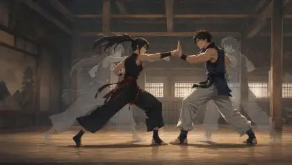
Introduction: Series Visual Unity Fails One Pretty Shot at a Time
Visual drift rarely announces itself in the first clip. You make a strong episode opener with soft cel shading, dusty rose skies, and thin ink lines. Then the second scene becomes glossy and blue. The third has thicker outlines. The fourth changes the character's eye highlights and suddenly the series feels like a playlist of unrelated tests.
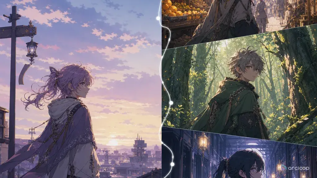
Series visual unity is the set of rules that makes separate anime shots feel produced by the same project. It is not a demand that every frame look identical. A night scene can be darker than a kitchen scene, and an action beat can have sharper contrast than a quiet close-up. The point is to keep the underlying visual system stable: palette family, line weight, shading style, texture level, light behavior, character anchors, and final-frame composition.
This guide shows how to write prompts and review notes that protect visual unity across an AI anime series. Use Style Pack Templates to choose a starting look, test one visual language with 90s Cel Animation Snapshot, and bind the approved images as Visual references under My Assets in ArcLoop Worlds before expanding into more episodes.
Core Principles for Series Visual Unity
Define a visual rule, not a pile of adjectives. "Soft nostalgic anime" is too loose. "Warm paper texture, thin brown line art, muted sunset palette, simple cel shadows, no glossy highlights" gives the series a repeatable surface.
Separate fixed rules from flexible choices. Fixed rules might include line weight, character eye shape, shadow edge, background texture, and aspect ratio. Flexible choices might include time of day, weather, accent color, shot scale, and motion intensity.
Keep character sheets and style references from fighting each other. A style reference should not redesign the character. A character sheet should not override the series palette. Give each reference one job inside the shot card.
Build a palette with roles. Instead of listing ten colors, assign jobs: base skin warmth, character accent, background neutral, danger color, magic color, night shadow. Role-based colors travel better across different scenes.
Match light behavior across cuts. If the series uses soft window bloom and gentle rim light, do not suddenly ask for hard neon glare unless the story location justifies it. Light behavior is often what makes shots feel from the same world.
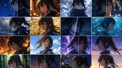
Review at thumbnail size. Visual unity is obvious when shots are small. Put three takes side by side and check whether they still feel like one series before judging tiny details.
Step-by-Step Series Visual Unity Prompt Method
Start with a two-line style bible. Line one names the production look. Line two names what must not change. Example: "Hand-painted coastal anime with thin sepia lines, soft teal shadows, and grainy sunset backgrounds. Never switch to glossy 3D, hard black outlines, or high-saturation neon."
Choose one hero reference. This can be a style frame, character sheet, or approved shot. Do not use five references with conflicting lighting. If you need more than one, label their jobs: identity reference, palette reference, background texture reference.
Create a reusable shot preface. Keep it short: approved character identity, approved palette, line style, shading style, and light rule. Then write the specific scene action after it. The preface should guide the shot, not bury it.
Define allowed variation. A series needs change. Say what can move by episode: weather, prop state, emotional intensity, costume layer, or location dressing. If every detail is locked, later shots become stiff.
Run a three-shot test. Generate an interior, an exterior, and a close-up. If the look survives those three contexts, it is probably stable enough for a short series. If one shot breaks, repair the visual rule before writing more episodes.
Bind the approved style image as a Visual reference under My Assets. Keep it visible alongside the storyboard so every new shot starts from the same surface logic instead of being re-described from scratch. For continuity checks, Three-Shot Continuity Board is a practical place to compare the output.
Bind the Visual Reference, Then Reuse It Across Shot Cards
Visual unity stops being a memory test once the reference lives in the product instead of your head. Bind the approved image as a Visual reference under My Assets, and keep it visible while you write each new shot card so you are always looking at the same reference instead of redescribing it. The goal is not to write a longer prompt every time; it is to reuse the same few visual decisions reliably.
Use one field for identity and one field for look. Identity covers face shape, hairstyle, outfit silhouette, and signature prop. Look covers palette, line, shadow, texture, and compositing. When a take fails, you can tell whether the character drifted or the production style drifted.
Approve visual unity before final polish. Upscale, texture detail, and stronger effects can make a drifting shot look more expensive, but they will not make it belong. The cheaper check is to compare rough takes side by side, fix the rule, then polish only the selected version.
Example prompt 1: Coastal Mystery Series Visual Reference
Use this as an image prompt to generate style reference images with Seedream 5.0 or Nano Banana Pro, then bind the results as Visual references under My Assets for an original 2D anime coastal mystery series called only "the harbor project" in production notes. Visual unity rules: thin sepia line art, muted teal and coral palette, soft cel shadows, grainy painted skies, low-contrast sea mist, and warm window light at night. Keep character identity out of these images — they cover environment only: cliff path at sunset, boat repair shed interior, and lighthouse stair close-up. Avoid glossy 3D, harsh black outlines, oversaturated neon, copied logos, and photorealistic skin texture.

This prompt creates a visual system before it creates an episode. The three swatches test whether the style can survive different locations.

## Example prompt 2: Same Look Across a New Episode Shot

```text
Use the approved coastal mystery visual unity card for a 7-second 2D anime shot. Character: Nella Rook, an original tide-map apprentice with short ash-brown hair, a rust-orange rain cape, dark teal boots, and a brass map tube. Scene: she enters a boat repair shed at dawn and notices wet footprints leading past the workbench. Camera: slow side tracking shot from waist height, keeping her cape shape and map tube visible. Apply the series look: thin sepia line art, muted teal and coral palette, soft cel shadows, grainy painted background, gentle mist in the doorway. Variation allowed: dawn light is cooler than the night shots, but the line weight and shadow style stay the same. No glossy render, no sudden neon palette, no face redesign, no text, no watermark.
The prompt allows a cooler dawn scene without breaking the series. It states what can change and what cannot.
Example prompt 3: Visual Drift Repair Pass
Revise the selected 6-second close-up for the coastal mystery series. Approved content: Nella Rook holds the brass map tube against her chest while listening outside the lighthouse door. Current problem: the take became too glossy, with hard black outlines and bright blue highlights that do not match the series. Preserve the character pose, ash-brown hair, rust-orange rain cape, brass map tube, door framing, and quiet listening action. Change only the visual unity layer: return to thin sepia lines, muted teal shadows, coral accent on the cape, soft cel shading, grainy painted door texture, and low-contrast mist. Keep the close-up readable at mobile size. No new camera angle, no outfit redesign, no neon glow, no photorealism, no fake text.
This prompt does not regenerate the story. It repairs the surface rules that made the shot feel like a different project.
Common Mistakes in Series Visual Unity
The biggest mistake is using a different style phrase for every shot. If one prompt says cinematic watercolor, the next says crisp modern anime, and the next says retro cel film, the series will drift even when the character stays similar.
Another mistake is treating color as decoration instead of system. A stable accent color, shadow color, and light color do more for continuity than a long mood paragraph.
Creators also let references compete. A character image, background image, and style image can each pull the output in a different direction. Label what each reference controls before generating.
A fourth mistake is approving shots one by one. A take can look excellent alone and still fail the series. Review at least three shots together.
Finally, do not make unity mean sameness. The viewer should feel the same production hand, not the same frame repeated. Keep the visual rules stable while changing story, staging, and emotion.
FAQ
How many visual rules does a series need?
Usually five to seven rules are enough: palette, line weight, shadow style, texture level, light behavior, character anchor, and aspect ratio. More than that becomes hard to check.
Should I use one style reference for every shot?
Bind one approved image as the Visual reference in My Assets and use it as the main anchor; add a shot-specific reference only when it solves a concrete problem for that one shot. Keep each reference's job clear — identity, environment, or lighting — so it is obvious why it is there.
How do I know if a shot broke visual unity?
Put it beside two approved shots at thumbnail size. If the line, palette, light, and texture feel like another project, repair the visual layer before polishing.
Can visual unity survive different locations and weather?
Yes, if you define what stays fixed and what can vary. Rain, night, interiors, and action scenes can all belong to one series when the line art, palette roles, shadow style, and character anchors stay consistent.
How do I keep AI anime episodes visually consistent?
Keep the same character assets and the approved Visual reference bound in My Assets across the whole project, reuse the same shot cards' @ references in every new shot, and check each new take against the same reference before moving on. That turns each new clip into a check against a fixed rule instead of a fresh guess.